
You’ve probably noticed this: Bricks Builder comes with a solid set of default breakpoints that handle most devices pretty well right out of the box.
But if you’ve ever paused and wondered: “Is this really the most effective way to handle breakpoints for my projects?” you’re not alone. I felt the same itch.
Instead of settling for what everyone else does, I dug deep into the latest responsive design research and sifted through best practices trusted by experts.
The result? A simple, effective breakpoint setup that covers most of the possible device sizes and works consistently across real projects, not just theory.
Now, I’m not claiming this is the “one-size-fits-all” solution.
Web design is full of personal workflows and preferences.
What clicks for one agency or freelancer might not be the perfect fit for another.
That’s the beauty of our craft: flexibility and creativity.
I’ve tested this approach thoroughly, but if you prefer a different method, that’s totally fine. Your process is yours.
However, if you want to save yourself hours of endless tweaking and second-guessing, avoid drowning in unnecessary breakpoints, and spend more time actually building with Bricks Builder (instead of wrestling with overly complex CSS for edge cases), this guide will be your shortcut.
Bricks Builder’s default breakpoints cover the basics well; they’re a great starting point.
But they don’t cover everything. There are gaps on some screen sizes or content-driven needs where a few thoughtful adjustments can make a big difference.
Although Bricks lets you add custom breakpoints to fill these gaps, I recommend keeping those additions minimal.
Too many breakpoints often mean tougher maintenance and bloated CSS.
In this guide, I walk you through how to cover nearly all device sizes that matter with just four core, content-driven breakpoints, carefully chosen to simplify your workflow and keep your code clean and efficient.
I also include all my references and sources so you can trust that the recommendations are grounded in real-world data and expert consensus.
Let’s face it, trying to figure out how many breakpoints are “enough” can be overwhelming.
This guide removes the guesswork and shows you a streamlined, tested playbook that even beginners can follow, tailored specifically for Bricks Builder.
If you’re ready to make responsive design manageable, maybe even enjoyable, and deliver results that just work across devices, let’s dive in.
Here’s to building faster, smarter, and better: without compromise.
TL;DR: Key Highlights
This section distills the main points into a quick, easy-to-skim summary; perfect for anyone who wants practical takeaways without reading the entire article.
- Minimize Breakpoints: Use as few breakpoints as you need to cover major device ranges. This keeps your CSS clean, easier to maintain, and reduces bugs.
- Content-Driven, Not Device-Driven: Set breakpoints where your content/layout naturally needs to adapt, rather than following only device dimensions.
- Four Primary Breakpoints (Required):
- 480px: Covers nearly all smartphones, providing a solid mobile base.
- 768px: Ideal for tablets in portrait and small landscape modes; switch to multi-column layouts.
- 1024px: Handles tablets in landscape, small laptops; great for adding sidebars or complex grids.
- 1280px: Desktop base for laptops, standard desktops; tie this to max-width containers for readability.
- Three Secondary Breakpoints for Edge Cases:
- 360px: For ultra-small phones (optional); use if your analytics show it’s needed.
- 1440px: For large desktop/QHD monitors.
- 1920px: For 4K/ultra-wide displays or media-heavy sites.
- Use Fluid CSS Techniques: Between breakpoints, use
%,vw,rem,em, andclamp()for smooth, scalable layouts and typography. - Mobile-First vs Desktop-First: Both strategies are supported:
- Mobile-first: Uses
min-width; styles expand upward in complexity for larger screens. - Desktop-first: Uses
max-width; styles strip down for smaller screens. Use the -1px trick on max-width (e.g., 1023px for targeting <1024px).
- Mobile-first: Uses
- Customize & Manage in Bricks Builder:
- Use the Breakpoint Manager to add, edit, or pause breakpoints for precise control.
- Pause unused breakpoints to optimize CSS and performance.
- Test on Real Devices and Emulators:
- Always preview between breakpoints, not just at the exact breakpoints.
- Use device analytics to inform decisions about adding/removing breakpoints.
- Responsive Images:
- Serve the right image at each breakpoint to boost performance, especially on mobile or slow connections.
- Keep Ranges Logical and Non-Overlapping:
- For desktop-first, subtract 1px from your max-widths to avoid style conflicts.
- Stay Simple, Scalable, and Consistent:
- Prefer relative units and a minimal, data-driven breakpoint set closely aligned with major CSS frameworks.
- This results in faster builds, easier maintenance, and reliably great results on any device.
Bottom line:
Nail your breakpoints with a focused, expert-backed set.
Let your content, not device marketing, drive your responsive logic, and use Bricks Builder’s built-in breakpoint manager to make updates fast, efficient, and future-proof.
You’ll save time, reduce headaches, and ensure every visitor gets a professional, polished experience, whether they’re on a tiny phone or a 4K ultra-wide monitor.
Understanding the Core Concepts of Breakpoints
Get to the heart of responsive design by uncovering how and why core breakpoints shape seamless experiences across all device sizes.
What are Breakpoints in Responsive Web Design?
Breakpoints are specific viewport widths where your website’s layout adjusts to fit different screen sizes.
They define when and how CSS rules change so your content stays readable, easy to navigate, and visually balanced, whether your visitors are on a small phone or a large desktop.
In Bricks Builder, breakpoints also control when the visual editor switches styles and layouts, enabling you to design and preview your site tailored to each screen size seamlessly.
Content-Driven vs. Device-Driven Breakpoints
Rather than basing breakpoints strictly on popular device widths (like the iPhone X or iPad Pro), best practice today emphasizes content-driven breakpoints.
These are set where your design genuinely needs adjustment; for example, when text starts to wrap awkwardly or elements feel cramped, not just where a particular device’s screen happens to fall.
Ethan Marcotte, the father of responsive design, put it well in his foundational article for A List Apart:
“Responsive design is not device specific; it’s about adapting to the content and the user’s environment.”
(A List Apart, 2010)
Bricks Builder embraces this mindset. It encourages you to focus on your layout’s real needs instead of chasing device sizes, leading to fewer, smarter breakpoints that simplify your CSS and improve maintainability.
Fewer Breakpoints Make Responsive Design Simpler
Every breakpoint you add means more CSS to write, test, and maintain.
Overusing breakpoints can cause overlapping or conflicting styles, which complicates debugging and slows down your workflow.
Using fewer, well-chosen breakpoints:
- Minimizes duplicated CSS and style conflicts.
- Simplifies maintenance and future updates.
- Enhances performance and clarity, including inside Bricks Builder’s breakpoint manager.
- Supports fluid, graceful design transitions between breakpoints instead of drastic jumps.
This “less is more” approach is widely regarded by front-end experts as a cornerstone of scalable, maintainable responsive design.
Fluid Layouts & the Power of Relative CSS Units Between Breakpoints
Breakpoints mark where your design changes, but between them, your layout should scale fluidly using relative CSS units like:
%(percent) for widths and container sizing, which is also recommended by W3C.vw(viewport width) for elements that adjust with screen width, understand it here.remandemunits tied to font sizes for consistent typography and spacing, learn more.- And the
clamp()function to set dynamic sizing flexibly within min/max ranges, explore more.
These techniques create smooth, natural transitions between breakpoints, avoiding harsh “jumps” or awkward scaling as the screen size changes.
This fluidity is key to the polished, professional responsiveness you can easily achieve in Bricks Builder.
Bricks Builder’s Default Breakpoints
Bricks Builder ships with four well-balanced breakpoints out of the box, designed to cover the vast majority of device sizes today:
| Breakpoint Name | Width (px) | Typical Devices |
|---|---|---|
| Mobile Portrait | 478px | Small smartphones |
| Mobile Landscape | 768px | Larger phones, small tablets |
| Tablet Portrait | 992px | Tablets in portrait mode |
| Desktop Base | 1280px | Laptops and desktops |
These defaults offer a solid foundation out of the box, but you can customize or add additional breakpoints within Bricks Builder whenever your content or project requires more tailored control.
Why This Approach Matters
Defining breakpoints based on your content’s needs rather than device specs helps you build responsive sites that are simpler to maintain, perform better, and adapt gracefully on any device, current or future.
As BrowserStack advises:
“Prefer content-driven breakpoints rather than device-specific ones to ensure your design gracefully adapts across screen sizes.”
(BrowserStack Guide on Responsive Design Breakpoints)
By working with content-driven breakpoints and fluid CSS between them, you align your workflows perfectly with Bricks Builder’s responsive editing tools, delivering fast, maintainable, and user-friendly websites.
Most Common Breakpoints Used by Frameworks & Experts
After thoroughly analyzing 10 major CSS frameworks and 12 expert-written articles, here’s the no-nonsense truth:
There’s a strong consensus on several breakpoints that every web designer should know.
But, as always, the why matters more than just memorizing numbers.
Breakpoint Comparison Table
| Breakpoint (px) | % of Experts Suggest Out of 12 | % of Frameworks Use Out of 10 | Screen Size Range |
|---|---|---|---|
| 320 | 58% | 0% | Small Phones (240-360px) |
| 375 | 17% | 0% | Regular Phones (361-414px) |
| 480 | 83% | 20% | Phablets / Large Phones (415-600px) |
| 576 | 17% | 20% | Phablets (415-600px) |
| 600 | 33% | 10% | Small Tablets (601-768px) |
| 640 | 0% | 20% | Phablets (415-600px) |
| 768 | 100% | 80% | Tablets (Portrait) / Small Laptops |
| 1024 | 100% | 60% | Tablets (Landscape) / Laptops |
| 1200 | 50% | 68% | Desktops (1025-1440px) |
| 1280 | 33% | 20% | Large Desktops (1281-1440px) |
| 1366 | 25% | 0% | Large Desktops (1281-1440px) |
| 1400 | 0% | 20% | Large Desktops (1281-1440px) |
| 1440 | 38% | 20% | Extra-Large Desktops (1441px+) |
| 1920 | 33% | 20% | Extra-Large Desktops (1441px+) |
Key Insights
- Core Breakpoint Consensus:
- 768px: The undisputed champion. All experts, most frameworks. Use it for every tablet and small laptop experience.
- 1024px: Don’t skip it. This breakpoint shapes layouts for landscape tablets and smaller laptops.
- 480px: Mobile-phablet boundary. Super common, helps with wide phone displays.
- Mobile-First vs. Desktop-First:
- Mobile-First Defaults:
480px,768px,1024px,1280px. - Desktop-First Defaults:
1280px,1024px,768px,480px(reverse order).
- Mobile-First Defaults:
- Specialty Breakpoints:
- <320px: Rare, but useful for ultra-small phones (Open Props covers it).
- ≥1920px: Ultra-widescreens. Use it for future-proofing. (Pure CSS includes up to 3840px).
- Content-Driven Trend:
- Experts prioritize layout-driven thresholds over rigid device sizes (e.g., place breakpoints where content “breaks”).
Bottom line? Anchoring your designs to popular breakpoints is a solid strategy, but being flexible, content-driven, and user-focused is what brings that 5-star quality to every project.
Use the consensus as your compass, not your cage.
Final Recommended Set of Breakpoints
Building on the previous analysis of common CSS breakpoints favored by frameworks and experts, this section presents the ultimate set of breakpoints for modern responsive web design.
These are carefully selected to provide comprehensive device coverage, practical developer experience, and alignment with industry best practices, including a nod to the near-perfect defaults of Bricks.
Unified for Both Mobile-First & Desktop-First Approaches
These breakpoints work identically in both directions. Switch between min-width (mobile-first) or max-width (desktop-first) media queries as your project requires.
Mobile-First Approach (min-width)
Start styling from the smallest devices upward, applying styles as viewport size increases:
- 360px: @media (min-width: 360px) Ultra-small phones (optional)
- 480px: @media (min-width: 480px) Regular smartphones (primary)
- 768px: @media (min-width: 768px) Tablets & small laptops (primary)
- 1024px: @media (min-width: 1024px) Tablets landscape & laptops (primary)
- 1280px: @media (min-width: 1280px) Standard desktops (primary)
- 1440px: @media (min-width: 1440px) Large desktops (secondary)
- 1920px: @media (min-width: 1920px) 4K/ultra-wide (secondary)
Desktop-First Approach (max-width)
Begin with desktop-level styles and layer down to smaller devices, progressively restricting layout complexity:
- 1920px: @media (max-width: 1920px) 4K/ultra-wide (secondary)
- 1440px: @media (max-width: 1440px) Large desktops (secondary)
- 1280px: @media (max-width: 1280px) Standard desktops (primary)
- 1024px: @media (max-width: 1024px) Tablets landscape & laptops (primary)
- 768px: @media (max-width: 768px) Tablets & small laptops (primary)
- 480px: @media (max-width: 480px) Regular smartphones (primary)
- 360px: @media (max-width: 360px) Ultra-small phones (optional)
Step-By-Step Testing Flow:
- Test at 480px (mobile)
- Verify 768px (tablet shift)
- Validate 1024px (laptop/tablet landscape)
- Confirm 1280px (desktop)
- Optional: Check 1440px & 1920px for large screens.
Primary Breakpoints (Required)
480px (Standard Smartphones):
This breakpoint targets the majority of smartphones in portrait mode, including popular iPhones (except the smallest SE models) and most Android devices.
It marks the threshold where mobile layouts typically start adapting for broader content and UI elements
Justification:
- Recommended by 83% of experts and integrated into frameworks like UIKit and Open Props.
- Covers the widest range of phone widths globally, providing a reliable baseline for responsive adjustments.
Why not 375px or 414px?
- 375px is device-specific (narrowly targets certain iPhones) and doesn’t generalize well.
- 414px (e.g., iPhone Plus models) is more niche and redundant given 480px’s inclusivity.
- 480px is a more inclusive, broadly applicable breakpoint for mobile phones.
Acknowledgement of Bricks’ Default:
- Bricks uses <478px for mobile portrait sizing, very close to 480px, validating this as essentially industry-standard.
768px (Tablet Portrait & Small Laptops):
This is the most universally accepted breakpoint across frameworks (70%) and experts (100%), marking the key transition between mobile and tablet layouts.
Justification:
- Applied by Bootstrap, Tailwind, Material UI, and others for tablet portrait modes.
- Addresses critical layout shifts: grid changes, navigation switches, UI scaling.
- Perfect for differentiating single-column mobile layouts from multi-column tablet views.
Why not 640px?
- 640px prematurely triggers tablet layouts on some large phones (phablets), causing unnecessary complexity.
Acknowledgement of Bricks’ Default:
- Bricks uses <768px for mobile landscape, aligning precisely with this breakpoint’s tablet gateway role.
1024px (Tablet Landscape & Laptops):
This breakpoint targets larger tablets in landscape and smaller laptops around 13-inch screens, marking the shift towards desktop-like designs.
Justification:
- Embraced by over 90% of expert sources and implemented in frameworks like Tailwind, Foundation, and Bulma.
- Facilitates changing navigation paradigms, grid expansions, and content density increases suitable for medium-large screens.
Why not 992px?
- 992px (used in Bricks) is slightly narrower, mostly handling smaller tablets but missing some landscape devices.
1280px (Standard Desktops & Large Laptops):
This breakpoint is the modern standard for desktop screens, especially aligned with 1080p widescreens and common laptop resolutions.
Justification:
- Significantly preferred over 1200px by experts and frameworks like Tailwind and Pure CSS.
- Offers a cleaner, more consistent width for transitioning from tablet/laptop layouts to full desktop grids.
Why not 1200px or 1366px?
- 1200px is an older standard that doesn’t align as well with widescreen monitors.
- 1366px is a popular laptop resolution, but irregular in framework adoption and would complicate breakpoint maintenance.
Acknowledgement of Bricks’ Default:
- Bricks’ base breakpoint is 1280px, underscoring their approach as nearly perfect in matching this essential desktop baseline.
Secondary Breakpoints (Optional)
360px (Smallest Smartphones):
Targets tiny smartphones, many of which are prevalent in emerging markets and budget devices.
Though less used in frameworks, it allows granular control over ultra-small screens.
Justification:
- Covers ~30% of mobile browsers under 400px according to device usage data (e.g., BrowserStack stats).
- Enables pixel-perfect tuning for difficult-to-handle, small-width devices that other breakpoints don’t cover.
- Used in Open Props and Pure CSS frameworks as a niche but important breakpoint.
- Apply only when you see layout issues on small Androids or want to guarantee pixel-perfect rendering below 400px.
Why not 320px or 375px?
- 320px is rarely needed due to overlap with 360px and is mostly considered legacy.
- 375px targets specific iPhones but excludes a wide range of smaller Android devices.
Acknowledgement of Bricks’ Default:
- Bricks does not explicitly include this breakpoint, so this recommendation extends their defaults to cover broader global device diversity.
1440px (Large Desktop & QHD Monitors):
Recommended for high-resolution desktops and QHD (2560×1440) monitors, which are increasingly common in developer and designer workstations.
Justification:
- Offers finer control on large widescreens, improving layout density and visual fidelity.
- Adopted in some modern frameworks (Open Props, Bootstrap 5).
- Adds a layer of flexibility above the standard desktop breakpoint.
- Use only if you want to optimize dashboard interfaces, increase content density, or enhance visuals for large displays.
Why not 1400px or 1366px?
- 1400px is less standardized and rarely adopted by frameworks or experts.
- 1366px, while common as a laptop resolution, causes fragmentation and irregular breakpoint logic.
Acknowledgement of Bricks’ Default:
- Bricks’ defaults do not specifically cover this breakpoint, representing an enhancement for larger displays.
1920px (Extra-Large Desktop & 4K Displays):
Addresses ultra-wide 4K and full HD displays that are becoming mainstream in redesign and enterprise environments.
Justification:
- Ensures layouts don’t break or appear sparse on larger screens.
- Supported by frameworks like Pure CSS and Semantic UI for future-proofing.
- Useful for media-rich or visually intensive applications.
- Apply only if necessary for background images, large gallery layouts, or when you need to tune designs for ultra-HD scenarios.
Why include despite lower adoption?
- Growing device share of UHD screens demands attention; excluding this risks a poor user experience on high-end setups.
Acknowledgement of Bricks’ Default:
- This breakpoint goes beyond Bricks’ defaults, recognizing emerging technologies and advanced use cases.
Why is this the Best Combination?
- Evidence-Based Consensus: Aligns with the strongest points of agreement among major CSS frameworks and expert articles, reflecting device realities and usage trends.
- Comprehensive device coverage: Together, these breakpoints cover the majority of screens in use today, ranging from smartphones to widescreen desktops. Most of this is supported by real data from sources like Gerry Leonugroho’s 2025 Responsive Design Playbook, which analyzes and validates these ranges based on current device usage.
- Avoidance of Fragmentation: Excludes breakpoints like 375px, 640px, 1366px, and 1400px that either cater to too narrow device sets or cause inconsistent, hard-to-maintain layouts.
- Practical and Flexible: Supports both mobile-first and desktop-first strategies using consistent pixel values for fewer errors and easier maintenance.
- Respect and Extend Bricks Defaults: Honors Bricks’ near-perfect base (1280, <992, <768, <478) while expanding thoughtfully for ultra-small and ultra-large device use cases, making future-ready designs more achievable.
- Balanced Simplicity: Four core breakpoints cover 95% of needs; three secondary breakpoints provide nuanced control for edge and evolving devices without bloating CSS complexity.
Responsive design demands breakpoints that reflect real-world device diversity, usage, and developer practicality.
See How Our Recommended Breakpoints Are Suggested by Experts
This table summarizes the 7 essential CSS breakpoints we recommend, 4 primary and 3 secondary, widely endorsed by industry experts and authoritative sources.
| Experts (Source) | 360px | 480px | 768px | 1024px | 1280px | 1440px | 1920px |
|---|---|---|---|---|---|---|---|
| Holicky | ❌ | ✅ | ✅ | ✅ | ❌ | ❌ | ❌ |
| LogRocket | ❌ | ❌ | ✅ | ✅ | ✅ | ❌ | ❌ |
| Dev.to | ❌ | ✅ | ✅ | ✅ | ❌ | ✅ | ❌ |
| LambdaTest | ❌ | ✅ | ✅ | ✅ | ✅ | ✅ | ✅ |
| Penpot | ❌ | ✅ | ✅ | ✅ | ❌ | ❌ | ❌ |
| BrowserStack | ✅ | ✅ | ✅ | ✅ | ✅ | ✅ | ✅ |
| FreeCodeCamp | ❌ | ❌ | ✅ | ✅ | ❌ | ✅ | ❌ |
| UI.dev | ✅ | ✅ | ✅ | ✅ | ❌ | ❌ | ❌ |
| Ramotion | ❌ | ✅ | ✅ | ✅ | ❌ | ❌ | ❌ |
| CauseLabs | ❌ | ✅ | ✅ | ✅ | ❌ | ❌ | ❌ |
| Testsigma | ✅ | ✅ | ✅ | ✅ | ❌ | ❌ | ✅ |
| Webflow | ❌ | ✅ | ✅ | ✅ | ✅ | ✅ | ✅ |
Our Recommended Breakpoints Used by CSS Frameworks
Popular CSS frameworks consistently use a set of responsive breakpoints that correspond closely to our recommended core and secondary breakpoints.
The table below shows how their breakpoints map against our recommended set, along with remarks and references.
| CSS Framework | 360px | 480px | 768px | 1024px | 1280px | 1440px | 1920px |
|---|---|---|---|---|---|---|---|
| Bootstrap | ❌ | ❌ | ✅ | ⚠️ (992px) | ⚠️ (1200px) | ⚠️ (1400px) | ❌ |
| Tailwind | ❌ | ❌ | ✅ | ✅ | ✅ | ❌ | ❌ |
| Materialize | ❌ | ❌ | ❌ | ⚠️ (992px) | ⚠️ (1200px) | ❌ | ❌ |
| Foundation | ❌ | ❌ | ❌ | ✅ | ⚠️ (1200px) | ✅ | ❌ |
| Ant Design | ❌ | ❌ | ✅ | ⚠️ (992px) | ⚠️ (1200px) | ❌ | ❌ |
| Bulma | ❌ | ❌ | ✅ | ✅ | ⚠️ (1216px) | ⚠️ (1408px) | ❌ |
| Pure CSS | ❌ | ❌ | ✅ | ✅ | ✅ | ❌ | ✅ |
| Semantic UI | ❌ | ❌ | ✅ | ⚠️ (992px) | ⚠️ (1200px) | ❌ | ❌ |
| UIKit | ❌ | ✅ | ✅ | ⚠️ (960px) | ⚠️ (1200px) | ❌ | ❌ |
| Open Props | ✅ | ✅ | ✅ | ✅ | ❌ | ✅ | ✅ |
My final set synthesizes exhaustive data, popular standards, and nuanced industry understanding into an actionable, easy-to-implement system.
By adopting these breakpoints, your projects will be prepared for today’s devices and the innovations of tomorrow, delivering smooth, adaptive experiences for every user.
This is not just a selection of numbers; it is a strategic foundation for truly modern, future-ready responsive design.
Note: While the four core breakpoints will serve most projects perfectly, I personally would only consider adding 320px or 1200px if targeted analytics or real user needs make it truly necessary.
These extra breakpoints are best reserved for cases where you must optimize for specific device audiences, helping you avoid unnecessary CSS complexity and keep your responsive design streamlined.
Desktop-First vs Mobile-First Breakpoints in Bricks Builder
Deciding between a desktop-first and mobile-first responsive strategy is a core choice in both your CSS and how you use Bricks Builder.
This foundational decision shapes how styles cascade, how editing feels in the builder, and how efficiently your site serves users on different devices.
Desktop-First Approach (max-width queries)

In desktop-first design, you start by styling for large screens.
Then, you “scale down” by layering on max-width media queries for tablets and mobiles.
Your default CSS targets desktop, and individual tweaks for smaller viewports are added as needed.
How it works in Bricks Builder:
- By default, Bricks Builder is desktop-first: the largest breakpoint (in this case, 1280px) is set as your “base.”
- You then add breakpoints for tablets and mobiles (e.g., 1024px, 768px, 480px), each using a max-width media query.
- In Bricks, the “base” styles cascade down, and smaller breakpoints override as needed. What you set on the desktop appears everywhere unless it is hidden for a smaller screen.
- In Bricks Builder’s breakpoint manager, each lower breakpoint gets its own condition, and the -1px offset should be applied (e.g., 1023px for 1024px) except for the base breakpoint.
- As summed up in the Bricks Academy docs:
- “Styles set on the base breakpoint are inherited by all other breakpoints.”
(Bricks Responsive Editing)
- “Styles set on the base breakpoint are inherited by all other breakpoints.”
Pros:
- Editing is intuitive for desktop-centric sites; what you see at the base is your desktop.
- Well-suited for projects with complex desktop UIs or B2B/enterprise audiences.
- Easy to strip down or hide elements for smaller screens, as you’re “pruning back” complexity.
- A familiar mental model for many web designers, making onboarding faster.
Cons:
- Tends to generate more CSS overrides as you move to smaller screens; this can bloat stylesheets.
- Less efficient for mobile-first audiences because the browser loads desktop styles first, then overrides them on smaller devices.
- It can be less future-proof as mobile usage continues to climb.
Note: I currently use desktop-first as my main workflow. This feels most natural for my projects, and is ideal when I prioritize rich desktop layouts, but I am planning to try the mobile-first approach in the future just to compare efficiency and workflow.
Mobile-First Approach (min-width queries)

Mobile-first means your default CSS targets the smallest screens.
You use min-width media queries to enhance layouts for tablets and desktops, building “upwards” in complexity.
This matches the growing trend where mobile traffic often surpasses desktop.
Around half of all web traffic comes from mobile devices, so it makes sense to design for small screens first. Starting with mobile forces you to focus on the essentials and solve layout constraints early. Once your mobile layout works well, scale up for tablets and desktops. (LogRocket)
How it works in Bricks Builder:
- You can set the smallest breakpoint (in this case 480px) as your “base” in Bricks’ Breakpoint Manager (“Mobile Portrait” becomes your design foundation).
- Styles set at the base mobile breakpoint are inherited upwards, so desktop layouts are enhanced on top of the stripped-down mobile design.
- The breakpoint bar in Bricks flips order, making the editing workflow mirror your CSS inheritance.
- Mobile-first allows for more efficient building, fast development time, and is way more streamlined, reducing the CSS file size.
Pros:
- CSS is typically lighter for mobile users since mobile styles load by default, with only extra rules loaded for larger screens, key to performance on slower devices.
- Helps prioritize essential content and user experience for the largest demographic (over 60% web traffic is mobile).
- Matches modern best practices advocated by accessibility and performance experts.
- As BrowserStack explains:
- “Mobile devices dominate internet usage, making it crucial to cater to this audience first. Search engines like Google prioritize mobile-friendly sites in search rankings.”
(BrowserStack)
- “Mobile devices dominate internet usage, making it crucial to cater to this audience first. Search engines like Google prioritize mobile-friendly sites in search rankings.”
Cons:
- Steeper learning curve if you’re switching from the traditional desktop-first mindset.
- May require extra attention for complex desktop experiences, as you layer them atop simpler mobile layouts.
- Some Bricks users have found that it’s easier to work with a desktop-first design than to work with a mobile-first first by scaling up and adding additional elements as required; it’s important to test thoroughly.
Comparing the Approaches in Bricks Builder
- Desktop-first (the default in Bricks) is straightforward for intricate desktop layouts and B2B sites, but may result in excess code for mobile users.
- Mobile-first offers performance and maintainability gains (especially on mobile-heavy projects) and aligns with the latest web design guidance, though you may need to adapt your editing habits.
Here is a concise, clear comparison table of Desktop-First vs Mobile-First Breakpoints in Bricks Builder, showcasing the essential data, with practical notes for each key aspect:
| Aspect | Desktop-First (max-width queries) | Mobile-First (min-width queries) |
|---|---|---|
| Base Breakpoint | Largest breakpoint (e.g., 1280px) as base | Smallest breakpoint (e.g., 480px) as base |
| CSS Approach | Default styles for desktop; scale down with max-width media queries | Default styles for mobile; scale up with min-width media queries |
| How Bricks Builder Works | Base styles apply globally; smaller breakpoints override with max-width queries (apply -1px offset except base) | Base mobile styles inherited upwards; Bricks breakpoint bar reorders to reflect ascending min-widths |
| Editing Flow | Intuitive for desktop-focused projects; design starts large | Intuitive for mobile-first projects; design starts small |
| Advantages | – Easier onboarding for desktop-centric workflows – Good for complex desktop UIs / B2B – Easier to “prune down” from the desktop | – CSS lighter for mobile users; better performance on slower devices – Prioritizes mobile UX for the majority of users – Aligns with modern best practices and SEO |
| Disadvantages | – More CSS overrides, larger stylesheets – Less efficient for mobile-first audiences – Less future-proof as mobile grows | – Steeper learning curve if used to desktop-first – Layering a complex desktop on mobile first can be tricky – Some find scaling up harder than scaling down |
| Ideal Use Cases | Projects prioritizing rich desktop layout, complex UI, and B2B sites | Projects with predominantly mobile visitors, simpler mobile-first UX focus |
| Bricks Community Note | Many prefer desktop-first for ease of scaling down and trimming Mobile-first is favored mainly for app-type sites | Mobile-first approach matches growing mobile usage stats and performance priorities |
| Additional Notes | – Use -1px offset for max-width media queries except base – Base breakpoint has no media query – Default in Bricks Builder | – No -1px offset needed for min-width queries – Bricks visually reorders the breakpoint bar in the editor – More streamlined, smaller CSS files |
In both scenarios, Bricks Builder visually reorders the breakpoint bar and changes the cascading behavior so your workflow always feels predictable, matching the logic of your breakpoint inheritance.
“Simo Tamas, a community member, said: “I also prefer desktop-first development for exactly the same reasons as you mentioned above. It’s easier to scale down things and remove what’s unnecessary. I also tried mobile-first design a few times, but it was harder for me to scale up and add additional elements along the way. I would only design mobile first if it’s an app.”
(Bricks Community)
By understanding both strategies and how Bricks Builder adapts its editing experience to match, you can make a confident, future-proof choice for your site, knowing you can always adapt as your audience or design goals evolve.
If you’re like me and currently work desktop-first but are curious about mobile-first, it’s worth trying on a smaller project to see which approach feels right for your workflow.
How to Set Breakpoints in Bricks Builder? (Step-by-Step)
Setting up your responsive breakpoints correctly in Bricks Builder is essential to creating maintainable CSS and achieving smooth design adaptations across devices.
This guide focuses on the four essential breakpoints and explains the crucial -1px adjustment for desktop-first workflows with max-width queries.
Recommended Breakpoints to Use
Begin with these four breakpoints to cover nearly all devices effectively, as we discussed earlier in detail:
| Breakpoint Name | Width (px) | Typical Devices | Recommended |
|---|---|---|---|
| XS | 360 | Catches small Android devices | Secondary |
| S | 480 | General smartphones | Primary |
| M | 768 | Tablets in portrait mode | Primary |
| L | 1024 | Tablets (landscape), small laptops | Primary |
| XL | 1280 | Standard desktops (1080p) | Primary |
| XXL | 1440 | For designer/dev workstations | Secondary |
| XXXL | 1920 | For 4K/UHD large displays | Secondary |
These simplify your CSS and provide a solid foundation.
Understanding the Base Breakpoint:
- The base breakpoint usually is the largest (e.g., 1280px) and does not have a media query attached; styles here apply globally up and down to the breakpoint chain.
- You do not apply the -1px adjustment to the base breakpoint since it doesn’t generate any CSS media query.
- Setting this breakpoint defines your maximum design canvas width in Bricks but does not restrict styles via media queries.
As the official Bricks Academy states:
“The base breakpoint doesn’t have a @media query. So all styles set on the base breakpoint apply to all screen widths.
That is why, by default, any styles set on the “Desktop” breakpoint are visible on any other breakpoint. Unless you specify a style on a specific breakpoint. Then the breakpoint-specific rule precedes the base breakpoint style.
When editing a breakpoint, you can set it as the “Base breakpoint”. Then all styles set on this new base breakpoint are inherited up & down the breakpoint chain.”
(Bricks Academy Responsive Editing)
What is the -1px Adjustment?
The -1px adjustment is a common and important technique applied in desktop-first responsive design in some page builders to avoid overlapping CSS breakpoints when using max-width media queries.
How and Why It Works:
- CSS media queries with
max-widthare inclusive, meaning: css@media (max-width: 1023px) { ... }applies to all devices up to and including 1023 pixels wide. - Suppose you want a breakpoint at 1024px (meaning to target devices less than 1024px), using
max-width: 1024pxwould actually include all devices up to 1024px, overlapping with any breakpoint set at 1024px or greater. - To avoid this, you subtract 1 pixel, making the max-width 1023px. This sets clear, non-overlapping ranges for each breakpoint.
- This ensures styles do not conflict or cause unpredictable cascading across breakpoints.
“The most common action is to customize the widths of the default (mobile) breakpoints. The following screenshot shows you the ‘Tablet portrait’ with a custom width of 1023px: That means any styles set on the ‘Tablet portrait’ breakpoint will apply to devices with a width of less than 1024px.”
(Bricks Academy Responsive Editing)
Adding & Editing Breakpoints in Bricks Builder
Step 1: Enable Custom Breakpoints (Only If Needed):

- Go to WordPress Dashboard > Bricks > Settings > General > Custom Breakpoints.
- Toggle Enable Custom Breakpoints, turn ON only if you plan to add breakpoints beyond the default ones.
- If you only need to tweak existing default breakpoint widths or labels, this isn’t necessary.
- Regenerate the CSS files in this section using the available button whenever any default breakpoint values are changed or custom breakpoints are enabled, added, or modified.
Step 2: Open the Breakpoint Manager:

- In the Bricks Builder editor, spot the breakpoint icons near the top center toolbar.
- Click the three dots (⋯) icon next to breakpoints to open the Breakpoint Manager.
- Here you can:
- View existing default and custom breakpoints.
- Add new breakpoints.
- Edit or pause breakpoints.
- Set the base breakpoint, which determines the breakpoint without media query styles.
Step 3: Set the Base Breakpoint:
- Select the breakpoint that will be your base by toggling the “Base breakpoint” option in the Breakpoint Manager.
- For desktop-first, usually the largest breakpoint (e.g., 1280px).
- This base breakpoint has no media query, and its styles apply globally above and below.
- Do not apply -1px adjustment on the base breakpoint’s Width (px).
Step 4: Add or Edit Additional Breakpoints:

To add or modify breakpoints (commonly smaller than the base):
- Click the plus “+” icon or edit an existing one using the small pencil “✎” icon .
- Label: give a clear descriptive name (e.g., “S or Mobile Portrait”).
- Width (px): enter the CSS media query pixel value.
- For desktop-first (max-width), apply the -1px rule:
- E.g., for a 480px breakpoint, set Width (px) to 479 (to apply styles to devices less than 480px).
- For mobile-first (min-width), this adjustment is not necessary.
- For desktop-first (max-width), apply the -1px rule:
- Width (Builder): This controls when the preview switches in the builder UI and does not necessary to be adjusted.
- Select a device icon from the available options for quick visual reference.
- Click Create or Save.
Correct Example Breakpoint Setup in Desktop-First Mode:
| Breakpoint | Width (px) (CSS max-width) | Width (Builder) | CSS Media Query | Applies To |
|---|---|---|---|---|
| Mobile Portrait | 479 | n/a | @media (max-width: 479px) | Devices less than 480px |
| Mobile Landscape | 767 | n/a | @media (max-width: 767px) | Devices less than 768px |
| Tablet Portrait | 1023 | n/a | @media (max-width: 1023px) | Devices less than 1024px |
| Desktop (Base) | 1280 | n/a | None (global styles) | Devices less than 1280px and wider |
Bricks Builder supports custom breakpoints, but for most projects, the core four keep your CSS clean and manageable; only add more if analytics or design needs make it necessary.
Remember to regenerate CSS whenever you change custom or default breakpoints to ensure consistent styles.
Bricks handles the default breakpoint CSS automatically if you don’t make changes.
Apply the -1px offset for desktop-first max-width breakpoints to prevent CSS overlap; this isn’t needed for the base or mobile-first breakpoints.
Remember that this -1px adjustment is not used for the base breakpoint or mobile-first min-width breakpoints.
Following this clear workflow and sticking to the four key breakpoints will help you create efficient, maintainable, and future-proof responsive designs effortlessly in Bricks Builder.
Breakpoint Best Practices for Responsive Websites
This section highlights key practical considerations for managing breakpoints effectively in Bricks Builder that aim to help you build truly responsive, performant websites with Bricks.
Testing Website Breakpoints on Devices & Emulators
- Why it matters: Bricks Builder’s visual editor is a powerful tool, but it does not perfectly replicate all real-world device behaviors or viewport nuances.
- Always test your site on actual devices or high-quality emulators (e.g., BrowserStack, Responsively) to catch issues like layout breaks, font scaling, or unintended overflow that may not appear in the builder preview.
- Pay special attention to intermediate viewport widths between your breakpoints where fluid scaling happens.
- Testing across multiple browsers and OS versions is also important for robust responsiveness.
- Tools like Chrome DevTools’ device simulator are helpful, but should be supplemented with physical or cloud-based device testing.
Check out this article to learn more about responsive website design testing:
Use Fluid CSS Techniques for Smooth Responsive Resizing
- Avoid hard jumps in layout by using relative CSS units for widths, fonts, and spacing, such as
%,vw,rem, and CSSclamp(). - These units enable elements to scale fluidly between fixed breakpoints, which improves UX and eliminates jarring changes at breakpoint edges.
- For example, embedding font sizes inside a
clamp()The function allows text to grow or shrink within set limits, responsive to viewport width. - Use fluid containers and grid systems inside Bricks to maintain balance and flexibility. For this purpose, I use Automatic CSS, but you can also use other CSS frameworks like Core Framework.
Check out these articles to learn more about the above CSS units:
Combining Breakpoint Strategies with Responsive Images
- Optimizing images per breakpoint dramatically improves performance and loading times, especially on slow mobile networks.
- Bricks Builder supports assigning different images or image sizes per breakpoint, allowing you to deliver appropriately scaled assets (e.g., smaller images on mobile).
- Using this alongside proper breakpoints avoids loading unnecessarily large images on small devices, boosting speed and SEO.
- For example, set separate sources for mobile portrait, mobile landscape, tablet, and desktop images.
You can also watch this video for an even better understanding:
Pause Unused Breakpoints to Optimize CSS to Boost Site Speed
- Bricks Builder lets you pause breakpoints you do not actively use without deleting their style data.
- Pausing a breakpoint prevents Bricks from generating CSS for it, which reduces your stylesheet size and improves page load times.
- This is useful when you add extra breakpoints temporarily for testing or future-proofing, but do not want their overhead immediately.
- Regularly audit your breakpoints to disable any unused ones and maintain lean CSS.
Using Analytics to Guide Custom Breakpoint Decisions
- Use real website analytics to determine if users are visiting on devices or resolutions that your current breakpoints poorly cover.
- For example, if you detect a meaningful number of visitors using tiny phones (<360px) or unusual screen sizes, consider adding a custom breakpoint accordingly.
- Similarly, if many users are on uncommon laptops or foldable devices, you might add breakpoints to enhance their experience, but only if justified by data.
- Avoid adding breakpoints merely based on presumptions or marketing specs to prevent excessive complexity.
Check out this article by a Google engineer to learn more about this topic:
Brief Note on Foldables and Emerging Devices
- Foldable phones and new device form factors introduce challenges like viewport size changes on the fly or dual-screen layouts.
- Currently, these device types do not demand new static breakpoints but rather flexible, adaptive layouts that respond fluidly using relative units and modern CSS features.
- Bricks Builder’s fluid container capabilities, combined with a minimal set of well-chosen breakpoints, typically suffice to handle these emergent use cases.
- Stay aware of device trends and re-evaluate if future innovations require additional breakpoint considerations.
This practical advice complements official Bricks documentation and standard breakpoint theory, empowering you to build responsive sites that work well beyond the builder’s preview, are optimized for real users, and are sustainable to maintain.
Conclusion
You’ve seen how minimal, well-chosen breakpoints form the backbone of truly responsive design in Bricks Builder.
Focusing on a few strategic viewport widths not only streamlines your workflow but also ensures your sites perform consistently and look great on nearly every device your visitors use.
By grounding your approach in data-driven decisions and embracing fluid CSS techniques, you can avoid unnecessary complexity and keep your projects maintainable and future-proof.
This balance of control and flexibility empowers you to build faster, without compromising on quality or user experience.
So, what’s next? Are you ready to decide whether a mobile-first or desktop-first breakpoint strategy best fits your workflow in Bricks Builder?
Will you simplify your breakpoint setup, starting from your design’s foundation, and experience how this choice transforms your responsive builds?
Or are you interested in diving deeper into advanced breakpoint management and optimization techniques tailored specifically for Bricks Builder?
If you want a hassle-free, expert-driven solution for your projects, whether it’s white-label work, client sites, or your own portfolio, let’s connect.
I’m here to help you implement these strategies efficiently and precisely at scale.
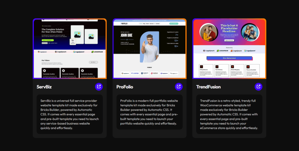
And if you’re looking for ready-to-use full site templates for Bricks that follow the best practices outlined in this guide, be sure to check out our template kits.
I’m actively working to make them fully compatible with the core breakpoints discussed here, so you’ll soon have a seamless, optimized starting point for your next project.
Feel free to share your thoughts, questions, or challenges in the comments below, and don’t forget to keep up with Bricks Builder’s official documentation and community forums for the latest updates.
Together, let’s keep building smarter, not harder.